Monitoring
Monitoring the correctness and performance of your airflow jobs (dagruns) should be a core concern of a BI development team. Airflow has good support for basic monitoring of your jobs:
- SLA misses: airflow is able to send out an email bundling all SLA misses for a specific scheduling interval.
- EmailOperator: airflow can send out emails when a specific point in a DAG is reached
- Sending notifications to popular online services like Slack or HipChat.
- The airflow dashboard itself, which you can manually refresh to verify which jobs ran successfully or failed recently.
- A PythonOperator, which can track the output of a particular task and then make more informed decisions based on the context in which it is run and then branch to a specific branch of execution for notificiation purposes.
This type of monitoring is very useful to track execution errors, but there are some cases where you need more sophisticated methods, for example in the case of data quality monitoring. This is where some great online services like Datadog come in.
Data quality monitoring
In online retail, the number of orders that are closed within an interval is not constant across all intervals. There are usually some peaks between breakfast and people first get to work, then a slight decrease over lunchtime and a much bigger peak when people arrive home, when they decide to make purchases based on email brochures they received or from recommendations by colleagues at work.
Let’s go with a hypothetical dataset and interval of 1 hour for ingesting the orders. We see large fluctuations of how many orders are actually ingested within each hour that could look like the following graph:
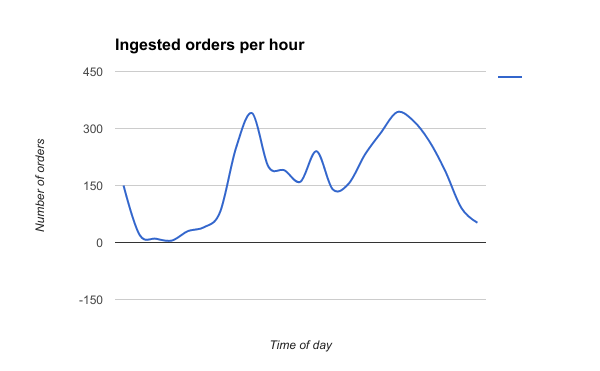
If we now apply a very simple threshold rule with a minimum and a maximum threshold, then it’s easy to see that our allowed error band for any given day can be very wide; so wide in fact that it may entirely defeat the purpose of having one in the first place.
What can we do to deal with highly variant data like the above example, but still want to apply a reasonably tight error boundary around our signal to detect potential data quality issues, for example when we didn’t ingest as much data from a source system as usual?
Airflow as of version 1.8 will have an integration with an online service called DataDog in the DatadogHook, which is a useful service that is able to receive all kinds of metrics from whatever source system you choose, including an airflow system that is set up to perform ETL. You can simply create a python operator that calls a python function and then use the hook from there.
Datadog has a lot of functionality built in with regards to alerting, muting, resolution and most importantly visualization of your metrics. A recent addition to Datadog, “Anomaly Alerts”, allow you to detect exactly the above scenario without having to implement this complicated sarima metric calculation (and verification of correctness).
Anomaly Alerts allow you to simply send a single metric to the service and then monitor that metric for errors outside the the typical trend for a normal hour or day. This seasonal and daily behavior of the metric is learned in a short time by machine learning and when it built a model (which could take up to a week), it will start predicting its own values and applies a user-configured error band around these predictions.
Taking it a step further
The above example uses simple ‘rowcounts’ as a metric; it answers the question “how many rows did I ingest from system A and was that the expected amount within a specific interval?”
But you can take this a lot further. Data quality can also concern itself with the quality of the ingested metrics and whether these add up. I’ve seen many cases for example that data was ingested in full, but some other script failed processing, a settings table was incorrectly configured and the end result was not what it should have been.
Before you start concerning yourself with a complex solution that accumulates snapshot tables and compare yesterday’s results vs. new results, consider applying the same approach to this problem.
We identified that business analysts would regularly run a number of queries to check data validity before they started working with the data. They run those queries because they do not unconditionally trust the underlying data. Well, those queries can be executed in an automated fashion on airflow and datadog will advise users if new metric data points violate the error boundaries. This works for daily ETL processes over a longer evaluation window, but also for much shorter time intervals.
Essentially, it allows you to build almost real-time data validation into your data warehouse and if everyone has a login for datadog, you can set up dashboards and other means to communicate more useful information about potential data quality failures, speeding up the process of detecting the root cause.
Beyond detection
So Datadog is great at supporting you to detect data quality issues and visualizing your data trends on a dashboard of your choice, but how else can datadog be useful? We use post mortems to identify the true root cause of specific incidents. In the process of doing that, we document everything about the incident in a post mortem document, which is a great way to communicate the true impact of ETL failures, data quality issues and the likes. If you track data quality using datadog services, there’s a feature called “Notebooks”, which helps you to enrich these post mortem documents using these datadog notebooks. You can collect a set of metrics together and point out indicators, issues and trends using the metrics that were uploaded to datadog and surround that with additional rich text to tell a better story. The true benefit of that functionality is that it’s a whole lot faster than copying and pasting content that you collect through a clipboard.